Interactive Design / Final Compilation
GAN YI KIAN / 0374572
Bachelor of Design (Hons) in Creative Media
Interactive Design / Final Compilation
Bachelor of Design (Hons) in Creative Media
Interactive Design / Final Compilation
INSTRUCTIONS
Exercise 1 - Web Analysis
We need to choose TWO (2) websites from the link given.taking note of its design, layout, content, and functionality. Identify the strengths and weaknesses of the website, and consider how they impact the user experience. Write a brief report summarizing findings and recommendations.
purpose and goals
the visual design and layout of the website
- color, typography, and imagery
the functionality and usability of the website
- navigation, forms, and interactive elements
the quality and relevance of the website's content
- accuracy, clarity, and organization
the website's performance
- load times, responsiveness, and compatibility with different devices and browsers
Website 1
 |
| (Source) |
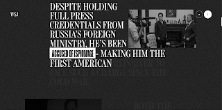
Purpose and Goals: "Letters to Evan" is a personal project sharing advice, reflections, or experiences in the form of letters, likely meant to guide or inspire someone named Evan.
Visual Design and Layout
Color:
The classic color scheme of black, white and gray is used on this website to look consistent, pure and simple.
Typography:
Typesetting text is mainly arranged on the left or right. Then use uppercase letters, two fonts.
Imagery:
The same photos are also added with black and white filters to make the entire page consistent and combined with the text. The photos will move up and down as the reader moves.
The functionality and usability of the website
Navigation
I think the navigation is good. Readers can be led to read the content, but one drawback is that they cannot stop at a certain point. This page will just keep going down.
Forms
The form is very simple and the page is not too cluttered.
Interactive elements
There are many interactive elements here, such as the effect of flipping the mouse over a button from white to black.
The quality and relevance of the website's content
accuracy
The information is clear and the writing is accurate.
Clarity
The overall page is clean and simple, I feel very comfortable.
Organization
The organization is very good, especially the arrangement of photos and text.
The website's performance
Load times
Almost no loading time.
Responsiveness
The response time is also fast.
Compatibility with different devices and browsers
I have tested it on Safari as well as Google Chrome, Microsoft Edge, and Firefox on my mobile phone, and the experience is equally smooth.
Website 2
 |
| (Source) |
Purpose and Goals:
The Emotion Agency website aims to showcase their expertise in creating innovative and visually engaging front-end solutions using modern technologies. Their goals include enhancing brand presence and providing tailored digital products for both Web2 and Web3 projects.
Visual Design and Layout
Color:
The Emotion Agency website primarily uses dark colors complemented by vibrant accents like electric blue, bright pink, and white. This combination creates a modern and visually striking design.
Imagery:
The Emotion Agency website uses high-quality, abstract imagery and animations that align with their modern aesthetic. These visuals enhance the user experience and reflect their innovative approach to frontend development.
The functionality and usability of the website
Navigation
The navigation of this web page also uses the mouse to scroll and the content appears according to its order.
However, when browsing on a mobile phone, content overlap may occur. I think it's also a bug or shortcoming.
Forms
Its form is very simple to operate, just slide it down with the mouse.
Interactive elements
It has a lot of interactive elements, but I personally think there are too many animations.
The quality and relevance of the website's content
accuracy
The Emotion Agency website features high-quality abstract imagery and animations that enhance user engagement and reflect their innovative frontend development approach.
Clarity
The Emotion Agency website has a clean layout and clear messaging, enhancing readability and effectively conveying their innovative approach through a strong visual hierarchy.
Organization
The Emotion Agency website is well-structured for easy navigation, with distinct sections for services, portfolio, and contact information. Consistent layouts and visuals enhance user experience and branding.
The website's performance
Load times
Not long to load.
Responsiveness
Responsiveness without much lag.
Compatibility with different devices and browsers
I think the performance on mobile phones is not good, and the browsers Google Chrome and Microsoft Edge can run normally, but the display on Firefox will be a bit laggy.
Exercise 2 - Web Replication
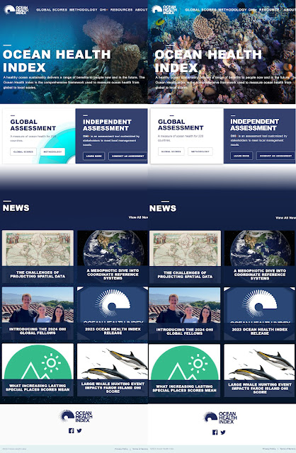
Final Outcome Web Replication 1
Left: Original
Right: My Work
Web Replication 2
Exercise 3 - Personal CV Page
Project 1-Proposal
Final Outcome
Project 1 : Website Redesign Proposal by GAN YI KIAN
Project 2-Prototype
Final Project - Final Working Website


.png)


.png)
.png)
.png)
.png)


Comments
Post a Comment