Application Design I / Project 3
GAN YI KIAN / 0374572
Bachelor of Design (Hons) in Creative Media
Bachelor of Design (Hons) in Creative Media
Application Design I
Project 3 / Lo-Fi App Design Prototype
INSTRUCTIONS
Project 3 / Lo-Fi App Design Prototype
Week 11
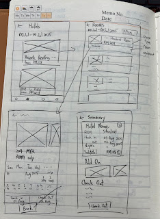
After I completed the whole process of booking a hotel, I showed it to Mr. Sylvain.After I finished the whole process of booking the hotel, I showed it to Mr. Sylvain. Then we need to build the sketches on figma for each scene before the next week.
Week 12
A good idea I came up with is to add a chat function. If today's target is a group of friends who want to book a hotel, they can all use this app and enter a group to chat, and at the same time they can share hotel information to this group. They can vote, compare hotels, and even plan the itinerary of the trip. More plans can be made in this group, and other members can also participate in the selection process.
Then based on this idea, I designed the first sketch on figma. Mr. Sylvain suggested that I could show the voting process of other friends in the group in the design, as well as more convenient sharing steps.
This is my final sketch. The next step is to add content and the overall app navigation system.
- Booking.com
- Agoda
- Tng wallet
- MarinaBaySands
SiteMap
User Feedback
User 1 - Kiwi
Feedback: I think the whole booking process is very smooth, the page design is clear, especially the function of filtering rooms by number of people, which is very convenient for people like us who travel in groups. The whole interface looks very modern. Regarding date selection, a monthly calendar view can be added.
User 2 - Yixin
Feedback: It's very convenient overall, with hotels, facilities, and activities all in one app. However, I wasn't sure where to start booking a room at first, and perhaps the button could be more obvious.
User 3 - Victor
Feedback: What I like most is that this app has made many optimizations for group users, such as the function of chat group. I often go out with friends, and many apps are mainly for individuals, but this one is different. Want to invite friends to join the booking process (like joint travel planning)
Final PNG
Final Lo-Fi App Design FIGMA link
FEEDBACK
Week 11
Specific Feedback: Regarding the object I chose, I had to create a process that facilitated the process of booking a hotel with many friends. Mr. Sylvain said I had to come up with a point of differentiation for the app itself.
Week 12
Specific Feedback: Can show more "group" functions in figma, because that is my special point, and the subsequent hotel booking process is quite ordinary and does not need to be emphasized
Week 13
Specific Feedback: Zoom in the main service button on the second page of the service page, and pay attention to the font size of other pages.
REFLECTION
Experience
In this project, I tried to think from the user's perspective and understand the user's real needs through observation, interviews and testing. The whole design process made me better understand how to make complex processes simpler and more intuitive.
Observations
I found that the original interface had some areas that confused users, such as unclear buttons, too many steps, or too dense layout. Many people hesitated when making payments or selecting functions, which meant that the process was not clear enough.
After revising and testing, I found that simple and clear designs are the most popular. As long as the interface is clean and the flow is smooth, users will be more willing to use it. Small details, such as automatic recommendations or save options, can also improve the user experience.


Comments
Post a Comment