Typography / Final Compilation & Reflection
22.04.2024 - 22.7.2024 / Week 1 - Week 14
GAN YI KIAN / 0374572
Typography / Bachelor of Design (Hons) in Creative Media
Typography / Final Compilation & Reflection
GAN YI KIAN / 0374572
Typography / Bachelor of Design (Hons) in Creative Media
Typography / Final Compilation & Reflection
INSTRUCTIONS
Task 1: Exercises 1 & 2
Task 2: Typographic Exploration & Communication
Task 3: Type Design and Communication
SUBMISSIONS
Task 1: Exercises 1 & 2
Fig 1.2 Final Type Expressions PDF (12/5/2024)
 | |
|
Layout Requirements
HEAD LINE
- Font/s: Bembo Std
- Type Size/s: 72 pt
- Leading: 36 pt
- Paragraph spacing: 0
BODY
- Font/s: Bembo Std
- Type Size/s: 9 pt
- Leading: 11 pt
- Paragraph spacing: 11 pt
- Characters per-line: 57
- Alignment: left justified
- Margins: 123 mm top, 26 mm left + right + bottom
- Columns: 2
- Gutter: 10 mm
 |
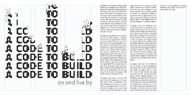
| Fig 1.4 Final Text Formatting Layout (25/5/2024) |
 |
| Fig 1.5 Final Text Formatting Layout with grid (25/5/2024) |
Fig 1.6 Final Text Formatting Layout PDF (25/5/2024)
TASK 2 / Typographic Exploration & Communication
 |
| Fig 2.1 Final Editorial Spread (8/6/2024) |
Fig 2.2 Final Editorial Spread PDF (8/6/2024)
 |
Fig 2.3 Final Editorial Spread with grid (8/6/2024) |
Fig 2.4 Final Editorial Spread with grid PDF (8/6/2024)
TASK 3 / Type Design & Communication
Vetroline download link: https://drive.google.com/file/d/1K97tMmERwnGGG4LS5igsZlO239gna1Sn/view?usp=sharing
Fig 3.3 Final Task 3A: Type Design and Communication "Vetroline" PDF (10/7/2024)
Fig 3.5 Final Poster PDF (10/7/2024)
REFLECTION
Experience
Before entering the university, the school automatically arranged courses for us, including the course of typography. At that time, I didn’t know much about the details of typography. I only knew that it was an important factor in design. I learned about it on the first day of class. With full expectations, Mr Vinod spent the next few days introducing us to the rules before handing us over to Mr Max. Mr Max is a very nice person and will patiently teach us any questions we have. Also because of this one-week class, I feel that the typesetting class makes me feel the most relaxed. I like the atmosphere of this class.
Observations
I feel that through this semester’s course, I have become better at observing. Especially when I go shopping, I will naturally observe the font design of the sign outside each store. I find it very interesting and it can also inspire me to have more ideas. idea. When other students in the class show their work, I will also observe the difference between their work and mine, because that is when they show their creativity and imagination. I will observe who is working hard and still working hard. Someone is doing their homework half-heartedly.
Findings
I used to think that I could design according to my mood, but after I took a typesetting class, I learned a lot of principles that need to be followed, and there are also some details that we need to handle carefully, such as kerning, layout proportions, and different situations using different fonts and so on. The typesetting we are learning can be seen everywhere in life. Now we know its principles and details that others don’t know.


Comments
Post a Comment